![cc_logo STACKED [S_RVSE]_web](https://blog.c-c.com.au/hubfs/cc_logo%20STACKED%20%5BS_RVSE%5D_web.svg)


Make your Landing Pages work harder with our handy guide
Increasing traffic to your website is a great start.
But it’s still only a start. What you really want are Sales Qualified Leads — those potential buyers who tick all the boxes for your sales team.
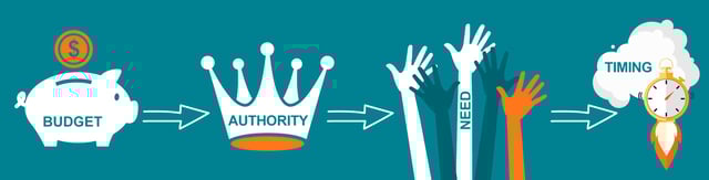
They are the people who tick all the “BANT” boxes. They have:
- The Budget to afford your product or service
- The Authority to make the decision to buy
- A Need that you can fulfil
- The Timing is right — now or in the very near future
To identify them from within your large and increasing stream of monthly traffic, you need to engage them and build a relationship.

And to do that, you need Landing Pages that convert.
In this article, we’ll give you ten actionable tips that you can put in place to optimise your Landing Pages, and greatly increase your chances of turning traffic into Sales Qualified Leads.
It’s your insight into some of the things we do as a digital marketing agency, when developing profitable Inbound Marketing campaigns for our clients.

While each Landing Page in your Inbound campaign will be different, (because each will be promoting a different offer), there are some key principles that nearly always apply, that will help you to achieve better results.
Landing Page conversion tip #1: Remove your site navigation
When people go to a landing page to fill out a form, you want them to do just one thing… fill out the form.
That’s why it’s a great idea to remove all distractions, including your standard website navigation at the top of the page.
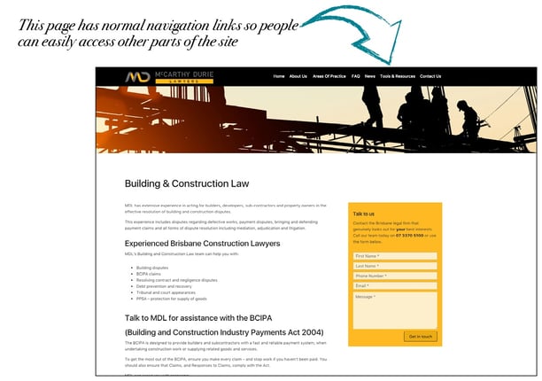
You can see examples of what we’re talking about below.
This first screen shot is a normal page on the website.It’s designed to make it easy for people to go elsewhere on the site from that page.
This second screen shot shows a Landing Page, with the navigation removed.
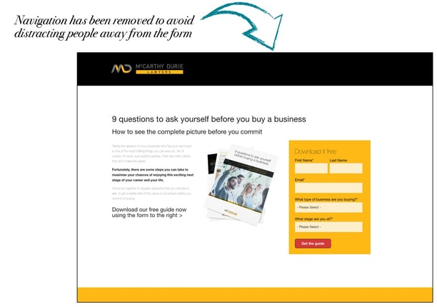
This takes away a possible distraction, and helps to guide people towards the desired ‘next step’ you’d like them to take.
Landing Page conversion tip #2: Keep it short – keep it snappy
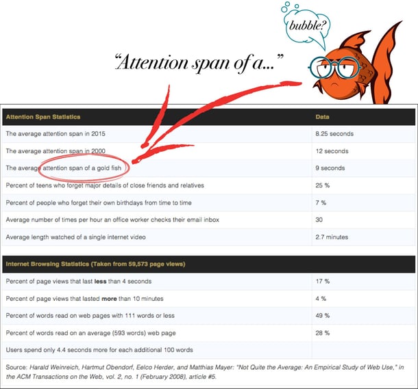
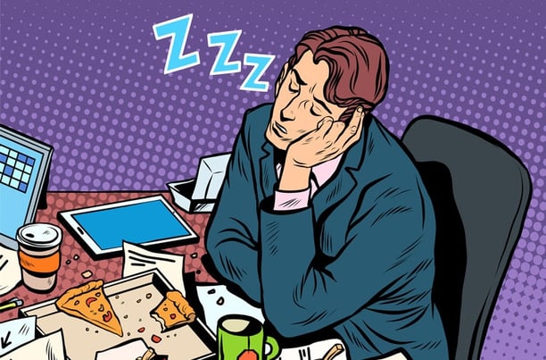
If you have read our article about getting better results from your SEO, you would have seen the data about people’s attention spans.
Tests have shown that it is now around 8 seconds.
You need to keep this in mind (not for long though. About 7.9 seconds should do it!) when creating your Landing Pages.
Online audiences WILL read through a lot of information — and yes, some long-copy Landing Pages have made millions of dollars. But you’ll find that such long copy Landing Pages are usually trying to convert people on a high-value sale, not a free download.
You are unlikely to convert very highly with long copy when you’re offering a free:
- Explainer
- How-To Guide
- E-Book
- Specification sheet, or
Of course, you might (and please let me know if you do). And you could always run some A/B version testing to see whether that additional copy increases your conversion rate.
As a rule though, short and snappy Landing Page copy is generally best.
Crafting punchy, engaging and persuasive web copy isn’t easy. As Blaise Pascal wrote in 1656, “If I had more time, I would have written you a shorter letter”.

But generally, putting the time and effort into making it short and snappy can significantly improve your Landing Page conversion rates.
Landing Page conversion tip #3: Don’t just ‘tell’ – be sure to ‘sell’
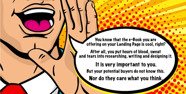
You know that the e-Book you are offering on your Landing Page is cool, right?
After all, you put hours of blood, sweat and tears into researching, writing and designing it.
It is very important to you.
But your potential buyers do not know this. Nor do they care what you think.
All they want to know is, WIIFM? (that’s “what’s in it for me?”)
Will this thing I’m about to download:
- Be useful for me, as I research solutions to my problem?
- Be relevant to me and MY particular situation?
- Give me what I want… right now… this minute… and provide the answers I need
People came to your Landing Page for a reason. So, in your short, snappy copy (see point #2 above), make sure you address that reason clearly and succinctly.
Don’t just tell them that it is an e-Book. (D'oh!)
Sell the BENEFITS they will get from downloading and reading it!
- Highlight the value of what you're offering
- Explain how it addresses their needs, interests, or problems
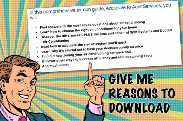
- Say “Inside this Guide, you’ll read the five biggest mistakes you can easily avoid…”.
Don’t just tell me.
SELL me!
Give me reasons to Click That Button And Convert.

Landing Page conversion tip #4: Ensure you meet people’s expectations
This one builds on our first point, where we talked about removing your site navigation.
People can easily become confused, lost or distracted — so make sure the message you are giving them on your Landing Page clearly aligns with their expectations.
When designing your Landing Pages, remember the expectation you have already set in the Call-To-Action that brought people to the page in the first place.
- If your CTA told them that they could “Download a Guide”, then make sure the message on the Landing Page reflects this when they arrive.
- If your CTA told them that they could “Register for Updates”, then make sure the message on the Landing Page helps them to do this when they arrive.
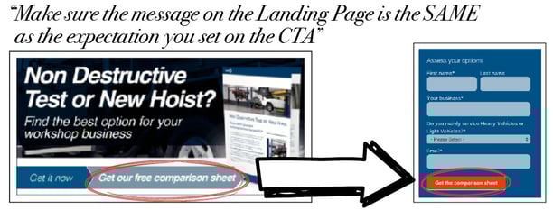
If a person expects one thing, but only sees something else, they will bounce off your landing page — and they won’t be alone.
Landing Page conversion tip #5: Give clear instructions
It’s an easy mistake to make. You’re so close to your project that you don’t see it through the eyes of someone else who’s not so familiar with the subject.
To you, it is very clear.
You know that all you want them to do is:
- Complete the form
and
- Click the button
But do your visitors know that?
Can they see that at a glance?

Your visitors have many other things on their minds — so make sure it’s clear how they can get the offer, so they don’t have to think about it.
Because they won’t be bothered.
If the next step is not immediately obvious, they will click away in frustration.
To help them, use text or design elements such as arrows to show them:
- Where to go on the page and
- What to do when they get there.
Keep in mind that you always want your main call-to-action to really POP off your landing page.
So, when you're encouraging visitors to fill out a form and click on that “Download NOW” button, make sure it's easy for them to see where it is.
Use complementary and contrasting colours to call a visitor's attention to exactly where you want them to go so they don’t have to think about it – they just do it. 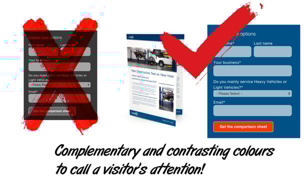
Landing Page conversion tip #6: Stay on-brand
To ensure your website visitor knows exactly where they are, keep your brand top of mind.
All your Landing Pages should have your logo placed strategically on the page — most likely in the header (where it is on the rest of your website).
While it isn’t the focal point of the page, it's important that people will recognise the landing page as being a publication of your business.
This is particularly critical for visitors who come to your Landing Pages from external non-branded sources, like social media and search
Once you've decided on placement for your logo, maintain that position on all your landing pages for consistency.
Building your brand so as to win the trust of your potential buyers is very important, as you move them through the stages of your Inbound Marketing campaign.
To learn more about how this works, get our Inbound Marketing explainer.
Landing Page conversion tip #7: Use images wisely
While displaying extravagant visuals on your landing pages may be tempting, A/B tests using HubSpot have repeatedly shown that including too many over-the-top images doesn’t help conversions.
Don’t use images just for decoration.
Use them to show value… to highlight a benefit… or to illustrate a point.
Otherwise, you risk distracting your potential buyers from the main point of the landing page, creation more friction and stopping them from converting.
The other issue with graphics is that they can also increase the load time of your website.
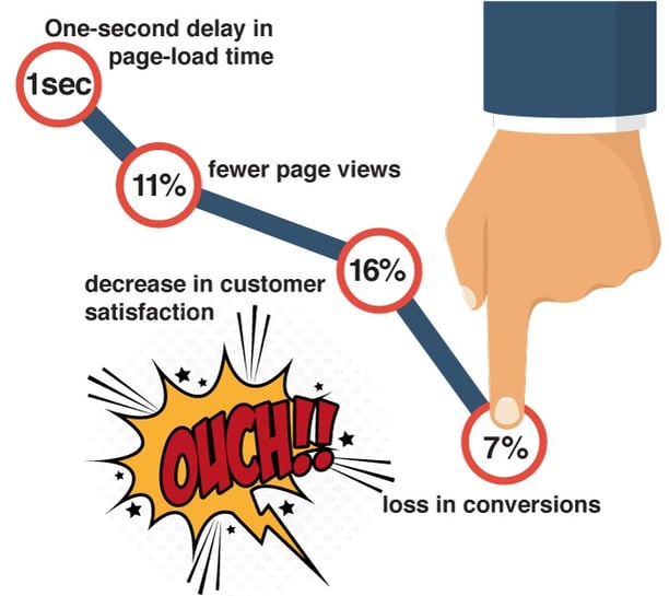
According to the Aberdeen Group, a:
- One-second delay in page-load time results in
- 11% fewer page views, a
- 16% decrease in customer satisfaction, and a
- 7% loss in conversions.
So, keep things simple. Make sure the images you use on your landing pages support – not distract from – the pathway to conversion.
And speaking of keeping things simple…
Landing Page conversion tip #8: Keep your design simple
In 24 years of marketing, (yes, before we had the Interwebs), I’ve learned a few things.
One of them is this: with Graphic Design, the rule of “Less Is More” is very powerful.
It is tempting to include rotating, flashing bells and whistles to “get people’s attention” and “make it more interesting”.
But don’t do it. It will likely cripple your conversion rate.
Keep it simple.
Clearly lay out your headlines, images, copy, and form so that you:
- Highlight the value of your offer, and
- Create a user experience that guides visitors to complete the conversion.
To do this:
- Use clear headers and sub-headers
- Use easy-to-scan bullet points (like these) to explain what they'll get from the offer
- Emphasise key points using bolded text or italics
I put the page through the ‘half-blind old fart test”.
Look at it with your eyes slightly out of focus to blur things a bit.
Or, if you are a half-blind old fart like me, just take your glasses off.
The idea is to see if the main elements (such as headline, bullet points and form/button) stand out.
If they don't, find a way to simplify your Landing Page design.
Landing Page conversion tip #9: Add social proof
Remember back at point # 3, I said something like…
Your potential buyers see offers all the time.
Some of them are great. Some of them are rubbish.
To help reassure them that YOUR offering is going to be good for them, try adding some social proof to your landing pages.
This adds third-party credibility and can help boost conversions.
- Do you have any case studies or testimonials you can pull quotes from?
- Are there comments from users who have downloaded your content and said nice things about it on Facebook or Linked-In?
- Do you have data about how many people have already downloaded this specific offer that you can highlight on the landing page (e.g. "1,100 people have already downloaded this e-Book!")?
This reassurance is very important, and might just be the thing you need to get more ‘clicks’ on that Landing Page!
Landing Page conversion tip #10: Be consistent
When producing Landing Pages for your Inbound Marketing campaigns, you may think that they all have to be different… each with a great new design.
Nope.
While it’s important to continuously A/B test elements of your Landing Pages for maximum results, don’t feel you have to radically alter your landing page layout every time.
A sense of consistency helps your potential buyers know how to navigate your pages over time, eliminating the friction caused by having to get the “lay of the land” each visit, and resulting in drop-offs in your conversion rates.
If it isn’t broken, then there is no need to fix it, right?
Not sure whether your Landing Pages are converting as well as they should?
If you’d like to talk about your current Landing Page strategy, then please give us a call on 07 3891 3800 or get in touch online.
We are more than happy to have a quick chat (with no charge and no obligation) about what you are doing — and what you could be doing to tweak a few more conversions each week from your Landing Pages. It can make a huge difference.
With Inbound Marketing, high converting Landing Pages are a vital link in the chain. You need to know that you have everything in place for success.
No matter where you are in Australia, Crockford Carlisle are here to help.