![cc_logo STACKED [S_RVSE]_web](https://blog.c-c.com.au/hubfs/cc_logo%20STACKED%20%5BS_RVSE%5D_web.svg)


Our Brisbane graphic designers and copywriters share 10 ideas to improve your business brochure
Because of our "free 2nd opinion" service, our Brisbane graphic designers and copywriters see a LOT of brochures. Some are good... some are OK... some are... well... an absolute dog's breakfast!
In this article, we are going to give you our "Top 10" principles that make a brochure more effective.
Is it important to get these right? Yep!
In a competitive market, your business brochure design has to work hard to connect meaningfully — so your potential customers can be cajoled, encouraged, reassured and motivated to the point where they will call you, come to your shop or take some other action.
If it ISN'T right, opportunities are lost and sales float away.

1. Break the brochure copywriting into chunks
We often talk to people who are concerned that their brochure is too 'cluttered' or too 'crowded'.
Usually, the problem isn't too much copy. It is just poorly typeset.
If your prospects are confronted with a sea of solid, unbroken type, there is a risk that they will THINK that it looks hard to read, and will put it aside. You need to break it up into chunks. This article is a case in point. Imagine how daunting it would look if it wasn't broken into paragraphs with inviting sub-heads and illustrations to make it more appealing.
Chances are, you wouldn't be reading it!
To make your business brochure more appealing to read:
- Use sub-heads
- Use highlight boxes
- Use bullets (like the list you are reading right now)
- Use numbered lists
These devices are all used by a good brochure designer, as they make it easier on the eye and help pull the reader into your copywriting.
As the graphic designers here in our Brisbane studio will tell you, typography is a science of its own — and with all the excitement of graphic design software offering so many special effects, it is often overlooked. This is a mistake. Good, clean typesetting will make or break a business brochure!

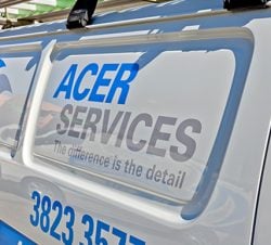
2. Use captions with images
If you are using images to illustrate a point in your brochure, be sure your graphic designer works with your copywriter to include captions to explain what the images are about.
People read captions.
Eye-movement tests have shown that they are often the first thing they will read on a page — and can influence their decision (or not) to become engaged in your marketing piece and read the rest of it.
3. Build your case with benefits
When it comes to sales, benefits bring buyers. Make sure your brochure copywriter understands this, and gives them the priority they MUST have. If you aren't sure how to identify the benefits you offer, remember that:
- A feature is what you have.
- A benefit is what your customer gets.
So dig deep. Find the benefits you have on offer, think in terms of "I have (xx feature) so you get (xx benefit).
Get together with your team and brainstorm this. Walk in your customer's shoes. Think about what they will get as a result of buying from you. Once you have this list, focus your brochure copywriting around each benefit on the list.
4. Get your brochure copywriter to use testimonials
I used to have to argue this point over and over with clients who felt that people didn't read or believe testimonials.
Seriously, if this is your view, you need to change it. It is no longer up for discussion.
How do we know?
Look at social media. Look at the power of user experiences and reviews as a MAJOR influencer of buying decisions! Your prospect needs reassurance, and there's NOTHING like a credible story from another person just like them to give them the confidence to take the next step.
If we are looking for accommodation when going on a holiday or business trip, we always read the user reviews on the hotel's website before making a booking. Testimonials are powerful. Use them!
5. Design your business brochure for ONE person
Always, always, ALWAYS remember that your business brochure is only being read by one person. Sure, from your perspective it is a tool to reach hundreds or thousands of people. But the reader doesn't care about 'the market'. They only care about their own little space in the great compost-heap of life.
And by the way, this rule applies to ALL marketing communications.
I remember seeing a sign outside of Yeppoon in Central Queensland years ago that read "Tourists Welcome".
Hello?
As I drove into Yeppoon, I wasn't a 'tourist'. I was... well... ME. It would have been so much warmer if the sign had said "You're Welcome".
You can see how it happened. Some well-meaning soul at the Chamber Of Commerce would have thumped the table at the monthly meeting and suggested that "We make all them tourists feel welcome with a big sign". Fine idea. But it should have been translated into a personal message for the PERSON reading it!
6. Use the front cover of your brochure as an ad
The first thing people have to do is to decide to read your brochure in the first place.
This is important. There are plenty of other ways to spend their precious time, and it is very easy for them to put it aside, You can't assume that they will open your brochure UNLESS you give them a good reason to do so.
So, think of your front cover as an advert. Have your copywriter write a 'teaser' message that gives people a REASON to open the document up and read more about what you have on offer.
7. Make sure your graphic designer remembers your audience
Sitting on my desk is a brochure from a national organisation offering expertise, support and motivation for business owners. It is, I think, inviting me to sign up.
Why do I say, "I think"?
Because I can't read the danged thing!
It really looks like the graphic designer went to great lengths to figure out how to create a brochure that is as difficult to read as possible. Seriously. The strong burgundy background combined with the black text is a nightmare.
The audience for this brochure is unlikely to be spring chickens. Most likely, they are going to be aged over forty. Some will have 20/20 vision, but most will be like me - squinters who wear glasses. They will all be very busy people in senior management positions, who won't have time to struggle with a difficult brochure.
As someone who is over fifty and is wearing glasses, I can tell you that reading this brochure was a real struggle. Frankly, I wouldn't have bothered if it weren't for my passion for marketing and copywriting!
While I am only guessing as an outsider looking in, (I have no idea how many responses they got), experience tells me that it was a complete waste of money. The cost of design, copywriting, printing and postage for this brochure would have been considerable - especially as it in on a substantial stock and is larger than a standard business envelope. D'oh!
8. Use short, punchy sentences
As I've said before, long copy is fine. If you have a benefit-rich story to tell, then tell it.
But be sure to tell it using short, snappy sentences. Make it easy for people to read. And while you are looking for ways to use short sentences, look for short words as well.
For example, don't say "discuss" when you can say "talk". And for goodness sakes, don't say "Pelagic" when you can say "Fish". (Seriously, I saw this once in an ad for fishing gear!)
Use plain language and use short words that people can easily and quickly understand.
9. Avoid reverse type
Reverse type is white or light coloured text on a black or dark background. It may be appropriate in small doses for a headline or highlight box, but use it sparingly. And DON'T use it in body copy. It will cut readership down significantly.
There will always be a graphic designer who will argue the point, saying that it can work. And in some cases, they might be right. But for my money, I'd avoid the risk. Skip it. Find another way to make the point, without putting a barrier in place that'll lose a chunk of your hard-won audience.
10. Have a clear call to action
Don't make people figure out what to do. They won't.
Tell them what to do in clear, easy to read instructions. If you want them to ring you, then say so. If you want them to look at your website, then say so. Whatever it is that you want people to do, make sure it is clear and obvioius.
And if you are offering a free consultation, make sure you find ways to add value to it, to increase the likelihood that they will give it a higher priority and take you up on the offer.
Our Brisbane Graphic Designers are here to help
Planning a new brochure for your marketing? Please talk to us about making the copywritng as compelling as possible, and the graphic design interesting and appealing. We have a great deal of experience and expertise, and will help you to gain an advantage with your:
- Corporate brochure
- Direct mail brochure
- Business brochure
- Presentation folder
The first step is to call us on (07) 3891 3800 and have a chat about your customers, your competitors and your marketing plan. We'll give you practical ideas and insights that will put you on the right track, and ensure that you get the best possible leverage from your sales and marketing collateral.