![cc_logo STACKED [S_RVSE]_web](https://blog.c-c.com.au/hubfs/cc_logo%20STACKED%20%5BS_RVSE%5D_web.svg)


Ever noticed that you have already formed an opinion about an organisation's service standards, quality and capability just from a brochure or business card? Even though you haven't spoken to or visited them, you ALREADY have a feeling about them.
Naturally, the reverse is also true: the people you want to do business with are making judgments about YOU, based on the presentation of your logo and marketing communications.
Many businesses use a logo that has been developed by a friend or someone with desktop-publishing experience, rather than a qualified graphic designer — and they pay the price in lost opportunity for years, OFTEN WITHOUT REALISING IT.
There is a LOT of behind-the-scenes work in developing an effective corporate brand. In fact, we allow roughly 30 hours for this type of project, which enables us to:
- research the market, looking at your competitors
- take a comprehensive brief to understand your current position in the market and your DESIRED position
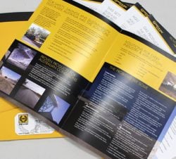
- develop four to six concepts — including considerations for integration of your positioning statement, type and colours
- discuss and analyse the artwork with you to obtain your feedback
- edit and fine-tune to arrive at the finished result
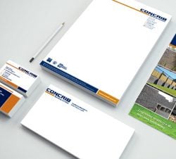
- develop your business card, letterhead and "with compliments" slips.
Tips and tricks of logo design:
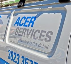
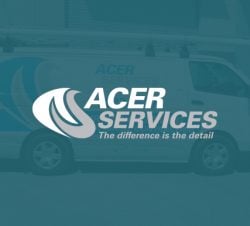
1. Less is more.Think of the Commonwealth Bank logo, then compare it with a too-complex home-made one that tries to say everything. The more complex your logo, the smaller your business is perceived to be.
2. Be aware of printing costs.
We try to use two colours where possible for logos. This means you won't always be stuck with full-colour printing in the future.
3. Use repeat elements.
Lines, shapes, colours that are repeated in a pattern result in a strong effect and give more impact.
4. Make sure it works.
Your logo must be easily recognised at a distance. It must also keep its integrity when photo-reduced or faxed.
NOTE: This also applies to letterhead layout. Avoid placing your logo at the top left, as it will push the content of your letters down way too far.
Action steps:
Your logo and company colours can be very powerful marketing tools. When developed correctly, your logo tells your customers that YOUR firm's products and services are:
- trustworthy
- high quality
- consistent.
Your corporate branding has a full-time job helping to persuade people to choose YOU rather than your competitors, so it's worth spending the time to GET IT RIGHT.
Let us take a look at your logo for you and discuss what needs to be done to lift your image. There is NO CHARGE for this meeting and it'll give you a better understanding of how we can help. Contact us today!