![cc_logo STACKED [S_RVSE]_web](https://blog.c-c.com.au/hubfs/cc_logo%20STACKED%20%5BS_RVSE%5D_web.svg)


What you need to know about Google’s “Mobile-First” index
You already know that mobile use is on the rise. We’ve been talking about it for a while, and it is a very real consideration when we’re planning the SEO strategy for our clients’ Inbound Marketing campaigns.
Here’s some mobile fun facts for you:
- Even as far back as 2015, more Google searches took place on mobile devices than on desktop computers
- 49% of B2B researchers who use their mobile devices for product research do so while at work
- 65% of smartphone users agree that when conducting a search, they look for the most relevant information regardless of the company providing the information. (Google, 2015)
(Source: https://www.hubspot.com/marketing-statistics)
Our own data bears this out, although it depends on the sector.
Some of our clients have rapidly increasing mobile traffic. Others are changing more slowly.
But in the scheme of things, if we stay on trajectory, mobile HAS to figure more and more in your thinking with your digital marketing strategy.
Google’s new “Mobile First” approach to their search index
With a trend this big, you can expect some big impacts. And SEO is one of the most significant areas where we’ve already begun to see the effects.
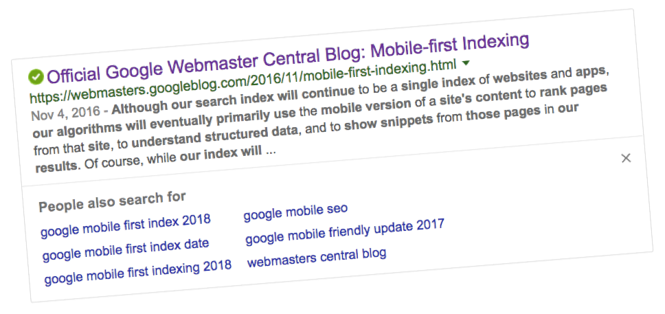
In 2016 Google announced that their long-foretold mobile-first search index changes were underway:
There’s no doubt that it’s coming soon to a website near you.
And if you aren’t prepared, the mobile-first index could sink your SEO strategy before you can scream “What happened to my business?”
That’s why we’re offering you this handy 8 point guide
If you follow these steps, you’ll be able to leverage Google’s mobile-first index to help you not only survive the changes, but thrive with them.
But first, let’s give you a heads-up about what mobile-first indexing is.

What is mobile-first indexing?
In the past, when your potential buyers typed a query, Google largely determined the results through a desktop-oriented method of ranking.
And this used to make sense.
But as you’ve seen, times are changing.
Yes, desktop will indeed be around for a long time, but Google has to respond to the reality of increasing mobile traffic. They want to make sure that people find what they are looking for when they search.
But here’s the thing.
There is only one index.
There’s not a separate index for desktop and one for mobile.
So once Google actions the change to mobile-first, they’re going to take the mobile version of your site and use it as the PRIMARY way to rank you — but not the ONLY way to rank you.
Which then begs the question…
What about SEO on your desktop site?
Let’s be clear: Google isn’t saying that this is a “mobile-only” shift.
It is a “mobile-FIRST” shift.
So even though Google’s mobile-first index will evaluate your mobile site first, that doesn’t mean it will ignore your desktop site.
And neither should your SEO team.
Your potential buyers don’t care about Google and the challenges of indexing. They just want to find the search results that are most relevant and helpful to them, regardless of what device they’re on.
And Google wants to help them do that.
So the mobile trend doesn’t mean that the curtain is about to drop on all desktop use. Not by a long shot.
So don’t use this update as an excuse to ignore your desktop site to get all those leads. In fact, when handled correctly:
- Getting your SEO strategy right for mobile will
- Still help your desktop SEO.
It can be a win/win. Yay!
The main thing is to keep this change in perspective. Google isn’t trying to do anything radical. And they aren’t trying to hurt your rankings.
If your site is truly relevant to a given search, then Google wants to rank you near the top regardless of the device that the searcher is using.
If someone types in “best law firm in Melbourne,” and you’re a top-notch law firm in Melbourne, then Google wants you to show up for the search — whether the person types it in on their phone or their desktop computer.
When will this change to Mobile First indexing take place?
The answer is rather frustrating. Google hasn’t given a specific date.

When Google’s Gary Illyes spoke at the SMX West conference in March 2017, he said Google would release mobile-first when their results are “quality-neutral.”
That means that they’re being really careful to make sure that search results stay as close to the status-quo as possible. Or even be a little better.
Google’s Webmaster Trends Analyst, John Mueller said (during a Google Hangout):
It’s possible that we’ll say, “well this batch of sites works perfectly fine on mobile-first indexing so we’ll just switch that over and wait with the next batch until we’re certain that they’ve been able to solve these problems”. But that’s something where we’ll have more information kind of as time goes by.
So with that uncertainty, there’s only one way to make sure that Google’s mobile-first indexing doesn’t hurt you:
Start preparing your mobile SEO strategy now.

Leveraging Google’s mobile-first indexing to your advantage is all about giving those who visit your mobile site the best experience possible.
So to start that process, here’s our super-helpful checklist to head you in the right direction.
Check load times and page speeds
1. You can test your website’s load speed on a number of sites.
For example, you can use Pingdom's free speed test tool:

Are your pages loading in 3 seconds or less? If not, you need to address this.
It may be an issue with your website. Or it may be that your web hosting service has old creaky servers… or is trying to share the available bandwidth across too many sites.
At Crockford Carlisle we don’t manage web hosting, nor do we have any affiliation with any service provider. However we do keep an eye on site speed for our clients, so if you are concerned and want a heads-up on what to look for, by all means give us a call on 3891 3800.
2. Check all of your dynamic elements
This is pretty simple: Can you easily see the content of your desktop site on your mobile device?
Sometimes that awesome graphic that looks so good on your website turns to a dog’s breakfast on a mobile.
And by the way, part of good UX (User Experience) design is to know when to hold ‘em and know when to fold ‘em.
In some cases, we prefer to set some elements to “hide when small” so that they don’t even appear on mobile.

That way, someone who is looking for a law firm to handle their conveyancing can get right to what they want — easily and quickly — without scrolling past images that don’t contribute to the story on a small screen.
3. Check whether or not your site is mobile-friendly or mobile-responsive
There is a difference between the two technologies. Here’s a quick overview for you.
What is Responsive Website Design?
A responsive website is one that responds (or changes) based on the needs of the user and the device (desktop/tablet/mobile) that they're viewing it on.
Key features of responsive websites:
- Dynamic content that changes
- Condensed navigation
- Optimized images
- Correct padding and spacing
- Mobile Phone Friendly

What is Mobile-Friendly Website Design?
A mobile-friendly website is one that is designed to work the exact same way across devices.
This means that nothing changes or is unusable on a computer or mobile device. Features like navigation drop-downs are limited, as they can be difficult to use on mobile. And no Flash animation is used.
The website is literally the same across the board, with no usability concerns regardless of the device on which it is being viewed.
Key features of mobile-friendly websites:
- Static content that doesn't change
- Simplified navigation
- Images display smaller on desktop
4. Check your mobile and desktop content is truly the same
This is tied in with the point above.
Mobile versions used to be watered-down versions of their desktop sites. And the likelihood of this is much higher if you have a different URL (m.yoursitehere.com).
If this sounds familiar to you, then you’ll want to check that ‘watered down’ doesn’t mean that important content that’s of interest to your potential buyers (and to Google’s spiders!) isn’t missing from your mobile version.
The last thing you want is to lose visibility for those profitable long tail search terms in your content.
It could already be hurting you. But it could kill you when mobile-first indexing kicks in.
5. If you have any hover elements, remove them
It may come in the future, but right now, there are no controls for hover elements in mobile. It is click, scroll or nothing.
So if you have any, remove them and figure out a different pathway for people to find the information they are looking for.
6. Say “no” to Flash
Flash was great way back when Flash was great. (Remember gazing in awe and wonder at those cool animations?).
But now it is too code heavy. Too slow. Too… well… Flash.
Some devices aren’t compatible with Flash. And that will mean your visitors will be greeted by this message:
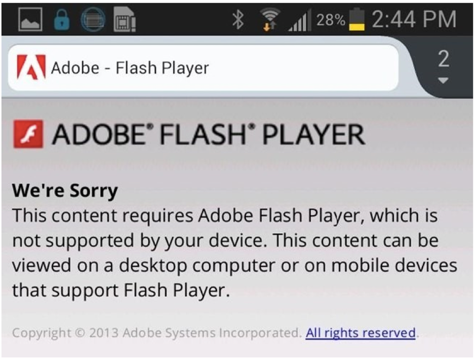
So don’t use it. Talk to your web developer about switching to Java or HTML5.
7. No pop-ups
Remember the last time you were foaming at the mouth and gnashing your teeth at a pop-up on your mobile?
You hated it. And you hated the business that put it there IN YOUR FACE.
We use pop-ups where appropriate on desktop sites to collect email to build lists, but we ALWAYS set them not to appear on mobile.
You should too.
8. On your mobile site, avoid really big graphics
Even on a desktop, large graphics will slow the page load down. On a mobile, they can be a nightmare.
And remember, landscape pictures don’t really translate well to smaller screens, where people are used to portrait.
To get the inside scoop straight from the horse’s mouth, read through Google’s Webmaster Blog Post.
Your focus moving forward is to consider proper optimisation and best practices.
The good news is, if your site is responsive, very minimal changes will be required. If you need to make any at all.
So that covers off on the “big picture” checklist.
Now, here’s more ‘bedtime reading’ to cover off about mobile-friendly design
- Do you have a default zoom capability turned on?
- Are your “tap targets” big enough for people with big, buttery fingers? 44 pixels of white space around elements is ideal.
- Are phone numbers on your site tappable?
- If you’re using web fonts, are they loaded correctly?
- Have you activated browser caching? This is primarily for user convenience.
- Do you have a specific mobile menu designed?
- Is your site grid fluid? (Proportionate vs. fixed)
- Are you using CSS media queries to define breakpoints?
- Are your website’s images resized for speed?
- Are your navigation features visible?
- Are you using a website builder? If so, is it mobile-optimised?
- Can your site builder detect which device your viewers are using and automatically adjust?
- Did you add your mobile site to Google Search Console?
- Have you checked your speed?
A special note about tabs and accordions on mobile responsive sites
If you remember back a few years, we were all cross and grumpy when Google said sites would be penalized for having content behind tabs or in accordions?
Our shoulders slumped. We got out our keyboards. Gripped our mouses. And re-designed them out of every site.
Well guess what?
Since screen real estate is such a prized commodity for mobile, having tabs and accordions is almost a necessity now.
Google’s John Mueller confirms this (in that same Google Hangout) when he said:
“The mobile-first indexing will index the mobile version of the page. And on the mobile version of the page, it can be that you have these kinds of tabs and folders and things like that, which we will still treat as normal content on the page. Even if it is hidden on the initial view.”
So there you go. Everything old is new again!
Get help with your mobile responsive website design
We provide digital marketing services to businesses throughout Australia. No matter where you are, if you want a hand with increased business growth from your website, then let’s have a chat about it.
It won’t be an ‘agency sales pitch’ when you call.
We’ll look at your site, have a chat about the opportunities that are open to you, and look at some options to make sure it is going to work properly on mobile as Google brings in these new changes. If we spot some immediate gains you could be making, we’ll say so and give you some helpful insights.
And from there, if you feel comfortable with our approach and would like to know more, we can discuss our processes, scope of service and costs.
Need help with digital marketing? Give Crockford Carlisle a call on 07 3891 3800 or get in touch with the contact form here.