The forms on your landing pages make or break your online conversion goals, so it pays to make sure you have them set up correctly.
So let’s dig in to see what you should be doing, and why.
The form is the entire point of your landing page
The form plays a crucial role in your landing page. It is the ‘next step’. If your landing page is:
- Offering an eBook, the form is the next step to get it.
- Offering a subscription, the form is the next step to get it.
- Offering a product guide, the form is the next step to get it.
- Offering an on-site consult, the form is the next step to get it.
- Offering a free report, the form is the next step to get it.
If people don’t fill out the form, then they don’t take the next step. And you don’t get your conversion.
As with much of digital marketing, there are no rules. But there ARE guidelines you can use.
Because lead-capture forms as so very important, there is a lot of research on exactly what information to ask for — and how to ask it so that more people will complete your form and convert.
After years of researching landing pages and spending time knee deep in these statistics, I've learned that there's no hard and fast rule that governs what fields are mandatory for all landing page forms.
The key is to balance:
- How much information you absolutely need, vs.
- How much information your prospects will actually provide on a form.
Let’s look at the steps you can take to help you determine what information you can (and should be) asking for on your forms.
The Six Second rule, and why you should reduce page friction
Here’s a quick question: How much information can you get someone to agree to give you in six seconds?
Too late. You are out of time.
You have roughly six seconds from the time a prospect visits your site until they decide whether or not to click the back button, so you want every part of your site doing its job.
You want to make it easy for people to engage, so that their back button is less appealing. To do this, you need to eliminate any friction on your landing pages.
Friction is any element of your website that is distracting or confusing — and which causes visitors to leave your page and, thus, abandon your form.
Examples of friction-causing elements include:
- Dissonant colours,
- Poorly typeset text (No sub-heads etc.)
- Distracting website navigation menus,
- Overwhelming the landing page with additional calls-to-action, and
- Landing page forms that are perceived to be too complex.
Quick note: More can sometimes be less
It is important to the remember that ADDING some elements will sometimes REDUCE page friction.
For example, a privacy policy is a sea of text on your page, and makes the whole thing look like a major challenge to get through.
By adding a simple link to your privacy policy, you will simplify the page, reduce friction and boost conversions.
Look for these opportunities to simplify things, so your prospect isn’t wading through waist deep mud as they progress through your landing page.
Best practice for creating website forms
With all the research that has gone into how long you should make your lead gen forms, there is a tonne of best practice material regarding what the optimal form length is.
As every business is different, your ideal form length may vary slightly from these best practices, but let’s unpack a few things to see what you can learn.
The industry baseline varies a bit, but most recommend somewhere between three and seven fields on a landing page form. As you can see in this chart from Eloqua which shows averages of up to 10 fields, there is a pretty significant drop-off in overall conversion rates after both three and seven fields.
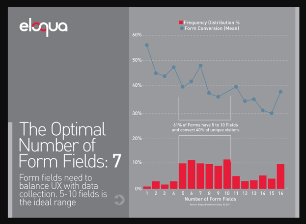
Like me, you might find this chart somewhat fascinating. It indicates that some marketers actually ask 16 questions on their landing page forms — and STILL drive conversions out of it.
That goes to show that there are some people out there who are so motivated to obtain certain offers and content, they are willing to provide 16 pieces of personal information to get it!
Quick reality check
Before you get carried away with excitement and start piling the questions on your forms, a reality check is in order:- We don’t know what that “Answer 16 questions and you can have it, Bucko!” content was — or how far down the nurturing route the form was.
- For example, it may have been some super-researched, high-value jaw-droopingly awesome industry info, aimed at a very select group of high-value prospects whose tongues were hanging out to get it.
- You MAY have a resource like that to offer on your landing pages. But mostly, you won’t.
As you can see, there is no single rule -- just guidelines based on how people generally behave online.
But as a rule of thumb, plan on:
- Name
- Email address
- Job title
- From there, you have approximately two to four fields left before best practices tell us you'll get a dramatic conversion drop off.
Consider what you REALLY need to know about your prospects
Online data can be magical. Every visit, click and Like can be tracked and catalogued in a spreadsheet somewhere.
If you are a geek, then the very blood in your veins will be thrumming at the thought of poring over it. But really... the question is, what data do you and your sales team NEED to get the job done.
On landing pages, the goal is to collect information to:
- Learn what your potential customers need from you so you can nurture them.
- Help your sales team with information about your potential customers, so they can spend more time ‘selling’ and less time ‘telling’.
For example, here is a form on one of our landing pages. This is right at the top of the funnel, so we only want to ask the basics to begin to populate our CRM with information.
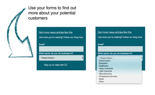
Some questions you could ask include:
- First name
- Email address
- Company name
- Job role
- Their biggest challenge (This could be a drop-down menu)
About that last question: “Your biggest challenge”
Giving your prospects the option to tell you their biggest challenge is incredibly helpful and it is something you should consider on your website.
It enables you to offer them additional information that is relevant to THEM. And it enables your sales team to better understand how they can assist this potential customer.
Smiles all round!
For example, if we asked this question on a form and you tell us that your biggest challenge is creating quality content, our automated nurturing system will wait five working days, and then email you an offer of a resource with information about Customer Personas, so you can learn how to pitch your website content to the right people.
Think about YOUR businesses. Would it make a difference if your sales team knew what your potential customers’ biggest challenges were before they even spoke to them?
Of COURSE it would!
So what else might you need to know? And when?
That depends on where the landing page form is in your digital marketing funnel, and whether you have your CRM integrated with your website to give you sophisticated lead profiling capabilities.
For example, let’s say you are selling medical supplies.
You have a sales team, and you want to set them up with qualified leads.
At an EARLY stage in your sales funnel, you might want to find out:
- The role of the person who is filling out the form.
- Purchasing officer
- Surgeon
- Theatre nurse
- The type of facility they are in
- Hospital
- Day clinic
- Doctors Surgery
- The particular area of medicine they specialise in.
- General medical
- Ear Nose and Throat
- Plastic Surgery
- ...and so it goes
A lead called Freddy has answered those questions to obtain your free “5 ways to Save Money On Medical Supplies” e-Book, and you now know that he:
- Is the purchasing officer
- At a day clinic
- Specialising in plastic surgery.
Next, (after about 4 working days), you can rock his day with an automated email, offering a free “Forceps Comparison Chart” that will help him to buy the right instrument for the job.
And at an LATER stage in your sales funnel, you might want to find out:
When he goes to download this awesome comparison chart, you might ask him:
- Where is his day clinic
- How many surgeons work there
- His biggest challenge when providing services to client
As you gather that data, you can then set up specific funnels to nurture the relationship with prospects in each sector.
And…
If you are selling nationally, knowing where Freddy’s clinic is would enable the lead to be sent automatically to the salesperson who manages that area.
A final word about your website's forms
Remember the big picture… as you build a profile of your potential customer, you need your forms to give you information, so you can:
- Customise your website content to ensure you meet their needs.
- Segment, target, and nurture them.
- Funnel them into your various marketing campaigns.
- Help your sales team get a better understanding of who they are talking to when the lead is passed through to them.
So yes… if that form isn’t optimised correctly, then your landing page isn’t worth having in the first place.
To find out more about the right length forms for your website — and how to set things up so you have more qualifed leads for your sales team to work with, please call Crockford Carlisle on (07) 3891 3800 today.


