![cc_logo STACKED [S_RVSE]_web](https://blog.c-c.com.au/hubfs/cc_logo%20STACKED%20%5BS_RVSE%5D_web.svg)


Why User Experience is your first priority
I’ve just been at a networking meeting. On learning that I represented a digital marketing agency, a chap (he has a home building business) collared me so he could tell me all about his new website.
Yay!
He (let’s call him “Bob”) thinks the website design is pretty good. He told me his marketing guy got a ‘great deal’ from a company in India, and the build is well progressed.
He enthusiastically showed me the pre-launch version on his laptop at a coffee table and asked me what I thought.
It was awkward.
So while I didn’t want to hurt his feelings, I’m going to share a couple of things with you, so you don’t make the same mistakes with your website design.
His two big website design problems were:
Error # 1 — Bob put pretty artwork ahead of meeting his customers’ needs
Error #2 — Bob forgot about Google, and what it needs to see on his site
Now let’s dig in and see what’s what…
Good website design requires ‘marketing’ thinking, not ‘artistic’ thinking
What I encountered with Bob at the networking meeting happens over and over.
In all the excitement of talking to his website developer about colours, the ‘look’ of the site, the positioning of the logo and the layout of the pages, Bob and his marketing guy forgot that the website they are building is supposed to be a business/marketing tool that brings in revenue.
It ISN’T supposed to be a work of art.
Don’t get me wrong, the use of colour, layout and the overall ‘feel are critically important issues with good website design. They can have a huge impact on conversions, and your web developer needs to give them serious attention at the appropriate stage.
But to get things headed in the right direction, the first thing you need to do is to figure out the OBJECTIVES and the STRUCTURE of your new website.
Think about your online customers – and think about Google
With all the changes that have been made under the hood of the Google Machine’s algorithm over the years, one trend has been consistent.
When it comes to search visibility, they have moved away from just the ‘techie’ stuff. Increasingly, they are focussing on the user experience (UX) and content quality.
They are looking at ‘intention’ and at ‘engagement’. Put simply:
- Are people getting what they intended to get from your website?
- Are people becoming engaged, and staying on the site for a while?
Google wants to be THE place that people go to find stuff.
Once your new website is up and running, Google will be keeping an eye on many things, including how people interact with it when compared to other websites in your sector.
The Google Machine will be watching user behaviour, and if the data from your website ticks the boxes, then you’ll get a tick towards where you’ll likely rank on the Google search page.
With this in mind…
Rule No.1: If it is good for your customers, it is good for Google.
That means that time spend thinking about your customers and what they want — and giving it to them on your website so they can find it and engage with it — is time very profitably spent indeed!
Please remember though, we don’t want to downplay the ‘techie stuff”. It is still vitally important — particularly with the emphasis Google is placing on good mobile design.
It plays a huge role in SEO. we spend a lot of time on it. But most of that comes later in the website design process. This article is about getting the EARLY fundamentals right.
Onward…
What are people looking for on your website?
The first thing to understand is that not everyone is ready to buy from you just yet.
Yes, some will be close to it. And for them, your product/service pages will be of interest because they are ready to get down to the nitty-gritty.
But many others will still have a process to go through before they are ready to throw their hard-earned in your direction — and you need to accommodate them when planning your new website.
In the early stages of the buying process, (the Awareness stage), they will be looking for broad information.
This is where your blog is so very important. This is where you want to put your ‘how to’ and problem solving articles and information
Don’t try and ‘sell’ what you do on your blog. Instead:
- It should educate,
- It should inform, and
- It should answer the questions that your potential buyers are asking.
Your blog is there to meet the needs of your potential buyers who are still researching and trying to understand what solutions are out there.
From there, you progress to your product or service overview pages. This is where you have a bit more detailed information about what you do, and the type of problems you can solve.
People who are further along the Buyer’s Journey (at the Consideration stage) will be interested in this type of information. They now have a fair idea of what they want, and are considering their options.
And then finally, as we said earlier, your detailed product/service pages are there for people who know what they want, (the Decision stage) and are now ready to buy.
These people now need testimonials and case studies — information that gives them confidence in YOUR ability to do the job when compared to your competitors.
Start your website design process with a ‘schematic’ layout
To enable you to plan all this out, start the process with a schematic layout of your website structure, like the one shown here.
Notice something?
There’s no logo. No pretty artwork.
But it DOES enable you to think clearly about what goes where. And that is important!
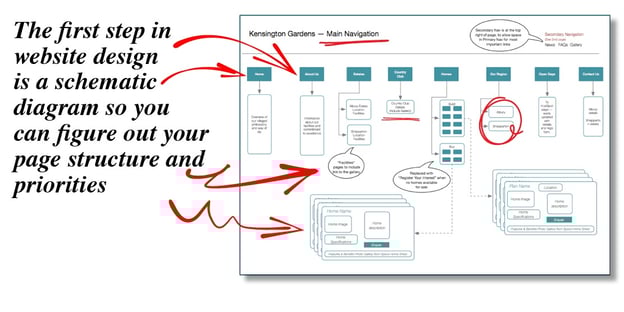
It enables you to plan which pages link to where, so you can make it easy for people to find things — and to send the correct SEO message to Google.
It isn’t pretty. But it’s not meant to be. It’s a very useful tool to enable your website designer to progress things to the next stage, with the correct foundations in place.
A word about structuring your website service/product pages and why they are so vital
When planning your website structure, it is important to understand:
- Google doesn’t direct people to websites
- It directs people to PAGES on websites
So if you want to increase your chances of being found, you need to have INDIVIDUAL pages for the products and services that you want to promote.
Wrapping it up — getting your website design right
We’ve covered a few more than the promised two errors in this article. But the main points underpin it all.
To re-cap on poor Bob’s misery:
Error # 1 — Bob put artwork ahead of meeting his customers’ needs
Error #2 — Bob forgot about Google, and what it needs to see on his site
It isn’t rocket science. But it IS important.
If you want to talk about your website design and what needs to be done to build a profitable asset, we are here to help. We are just a phone call away on (07) 3891 3800 no matter where you are in Australia.